
Ever walk into a room and immediately feel your shoulders drop? That’s not an accident. It’s usually a neutral room doing exactly what it was designed to do.
If your space currently feels like a cluttered mood board of five different aesthetics fighting for attention, you’re in the right place. Neutral decor isn’t about beige walls and calling it a day it’s a deliberate, layered design language that feels warm, expensive, and calm all at once. And stick around for tip #7 below, because it’s the one most people skip entirely and it’s the exact thing that separates a “neutral” room from a “boring” one.
By the end of this guide, you’ll have more than a dozen practical, budget-friendly ways to bring a neutral aesthetic into every room of your home — using natural, sustainable materials that feel good to live with, not just look at.
Save this guide for later so you have it on hand the next time you’re staring at a paint swatch wall wondering where to start.
What Does a “Neutral Aesthetic” Actually Mean?
Here’s the thing: neutral doesn’t mean colorless. It means color-quiet.
A true neutral aesthetic works with a muted, earth-inspired palette think warm whites, soft greige, oatmeal, clay, and taupe — instead of relying on bold, trend-driven hues that feel dated within a year or two. The goal is a home that feels grounded, cohesive, and timeless, no matter what’s happening in the design world.
Neutral decorating has grown fast for a simple reason: people are tired of visual noise. A calm, neutral home reduces the mental clutter you feel just by walking into a room, and it gives you a flexible canvas that grows with you instead of forcing a full redecorate every time trends shift.
It also pairs naturally with sustainable living. Because neutral palettes are timeless, they encourage a “buy less, buy better” mindset — you invest in well-made, natural-material pieces that last for years instead of chasing fast-furniture trends that end up in a landfill.
1. Start With a Layered Neutral Palette (Not Just One Shade)
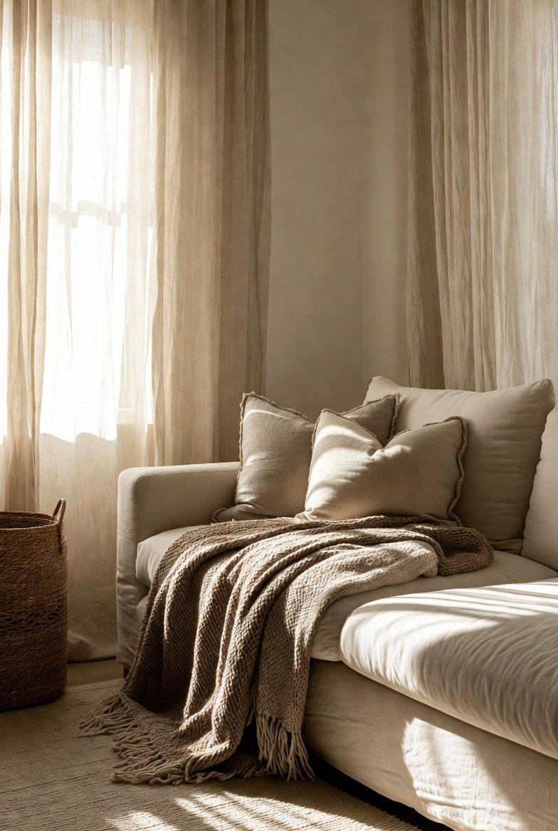
The biggest mistake people make with neutral decor is treating “neutral” as a single color. In reality, the most successful neutral rooms layer three to five different neutral tones together.
- Base layer: walls and large furniture in warm white, soft beige, or greige
- Mid layer: flooring, rugs, and larger textiles in tan, oatmeal, or taupe
- Accent layer: darker touches like walnut wood, charcoal, or espresso brown for contrast
This layering is what keeps a neutral room from feeling flat. Without it, you get a space that reads as empty rather than intentional.
Quick tip: if you’re nervous about committing, test your palette with low-VOC paint samples on a large poster board before painting the whole wall — it protects your indoor air quality and saves you from a costly repaint.
2. Bring In Texture Before You Bring In Color
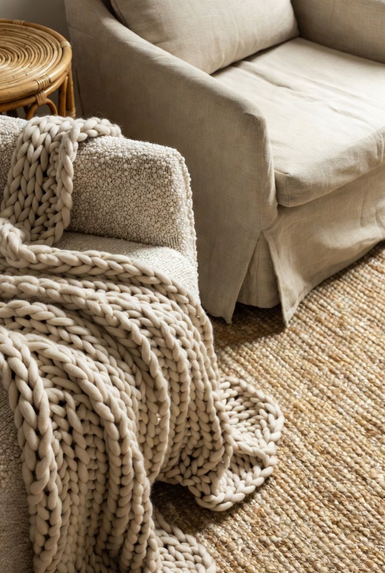
Since a neutral palette limits color contrast, texture becomes your main design tool. This is non-negotiable in a neutral room.
Mix in:
- Chunky knit or bouclé throws
- Woven jute or seagrass baskets
- Nubby linen upholstery
- Smooth ceramic vases
- Raw, unfinished wood
When you combine soft, rough, matte, and smooth textures in the same space, your eye naturally moves around the room even though the color palette barely changes. That’s the trick that makes neutral rooms feel rich instead of sparse.
3. Choose Natural, Sustainable Materials as Your Foundation
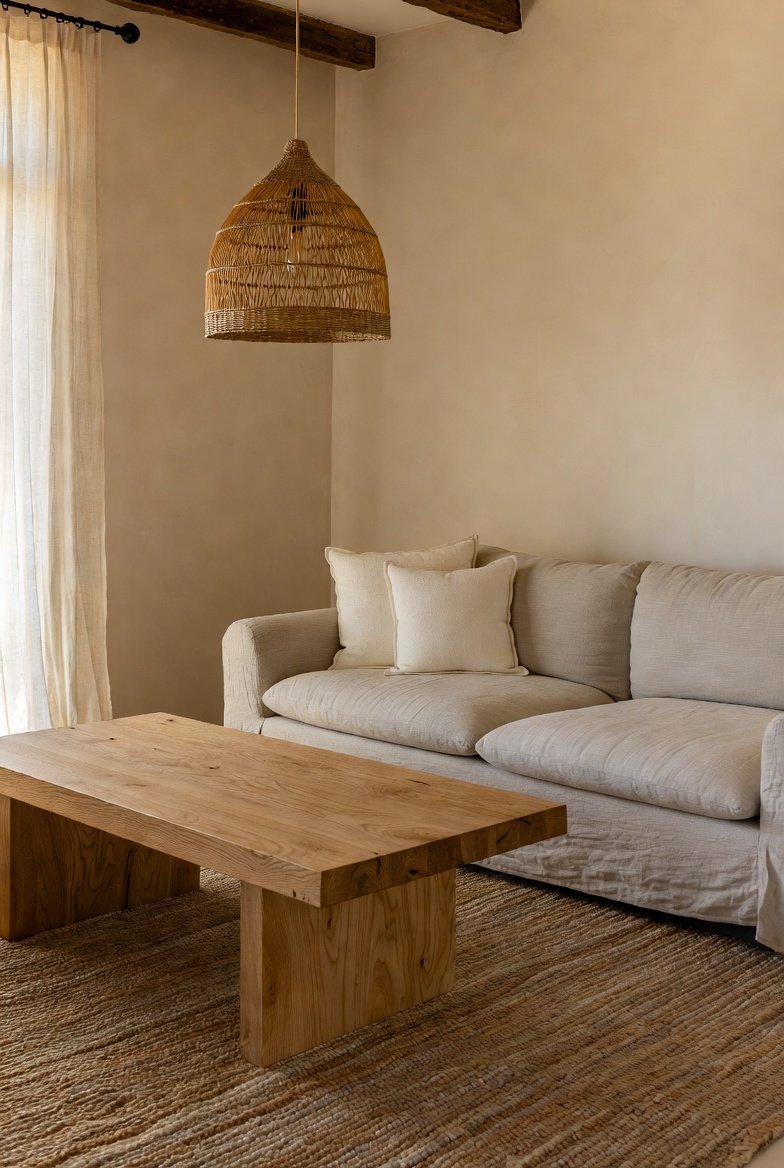
This is where a neutral aesthetic and an eco-conscious home naturally overlap and it’s the biggest opportunity most decor guides leave out.
Reclaimed wood, rattan, linen, jute, wool, and hand-thrown ceramics aren’t just on-trend; they’re inherently neutral in color and far kinder to your indoor air quality and the planet than synthetic alternatives. Look for:
- FSC-certified or reclaimed wood furniture
- Organic cotton, linen, or wool textiles
- Low or zero-VOC paints and finishes
- Natural fiber rugs (jute, sisal, wool)
Save-worthy takeaway: a neutral room built from natural materials doesn’t just look calm it is calmer, since you’re reducing the chemical off-gassing that comes with synthetic furniture and finishes.
4. Add a Statement Piece to Avoid the “Flat” Trap
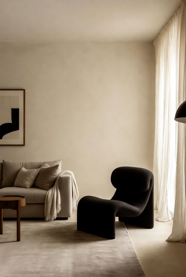
A common myth about neutral decor is that everything has to blend in. Not true. Even a fully neutral room needs one piece that draws the eye.
This could be:
- A sculptural wood or rattan chair
- An oversized ceramic floor vase
- A textured stone coffee table
- A bold-shaped mirror
The rest of the room stays quiet so this one piece can do the talking. Without a focal point, neutral rooms risk feeling like a hotel lobby instead of a home.
5. Add a Statement Piece to Avoid the “Flat” Trap
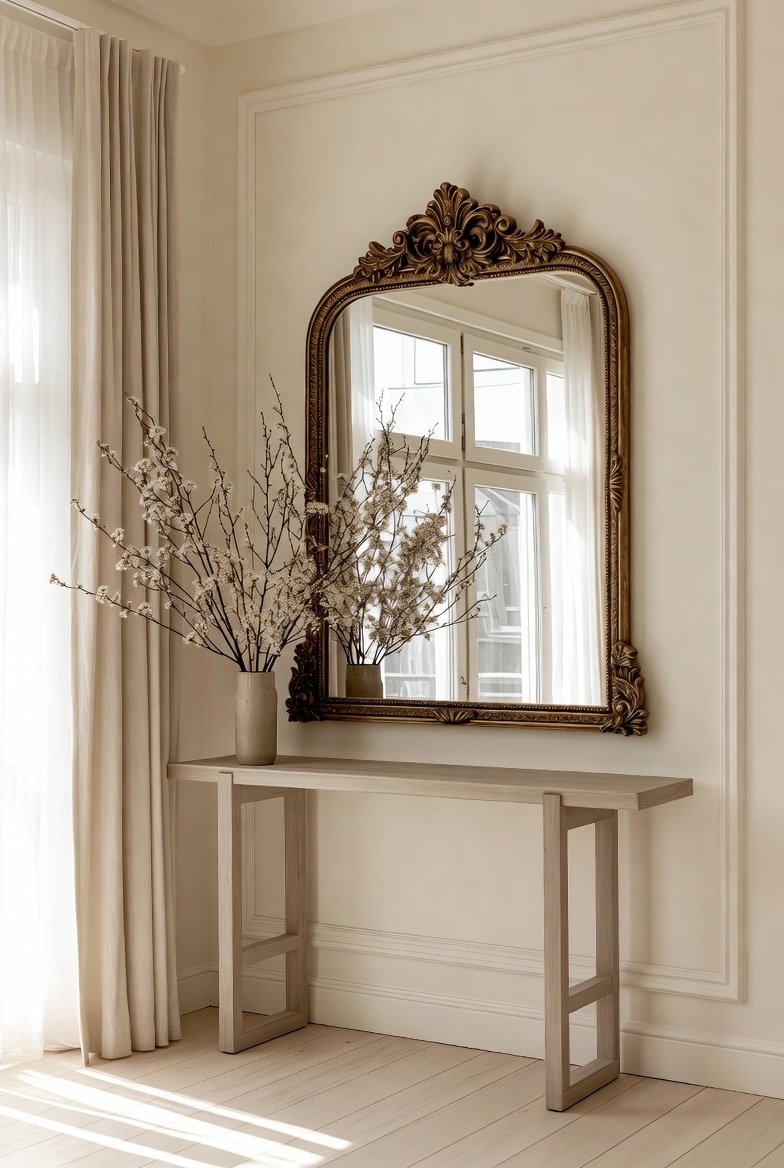
Mirrors are one of the most underrated tools in neutral design. Because neutral palettes rely so heavily on light to feel warm rather than washed-out, mirrors help bounce natural light around the room and make even a small space feel bigger and brighter.
Choose frames in wood, rattan, or brushed brass to keep the tone consistent with the rest of your neutral palette, and position mirrors across from windows for maximum light reflection.
Read Also: Green Nest Hubs
6. Let Greenery Do the Heavy Lifting
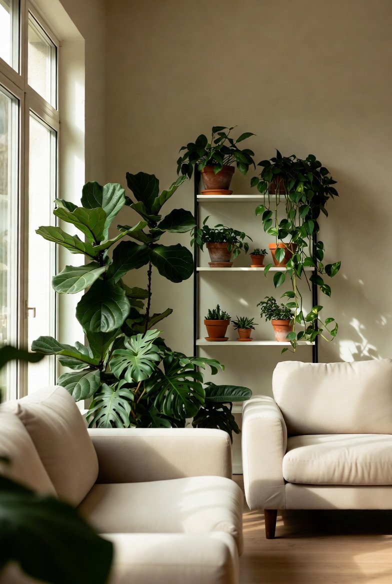
Here’s a rule worth remembering: the more muted your palette, the more your plants matter.
Indoor plants aren’t just decoration in a neutral home they’re doing real design work. Greenery is the one truly organic “color” that breaks up a muted palette without clashing with it, while also softening hard lines and adding life to a room that could otherwise feel static.
Easy, low-maintenance options for a neutral aesthetic:
- Snake plants (structural, upright lines)
- Fiddle leaf figs (bold, sculptural leaves)
- Trailing pothos (softens shelves and high surfaces)
- Dried pampas grass or eucalyptus (zero-maintenance texture)
Beyond aesthetics, plants also act as natural air purifiers, which fits perfectly with a wellness-driven, eco-conscious neutral home.
7. Create “Pinnable” Vignettes With Curated Groupings
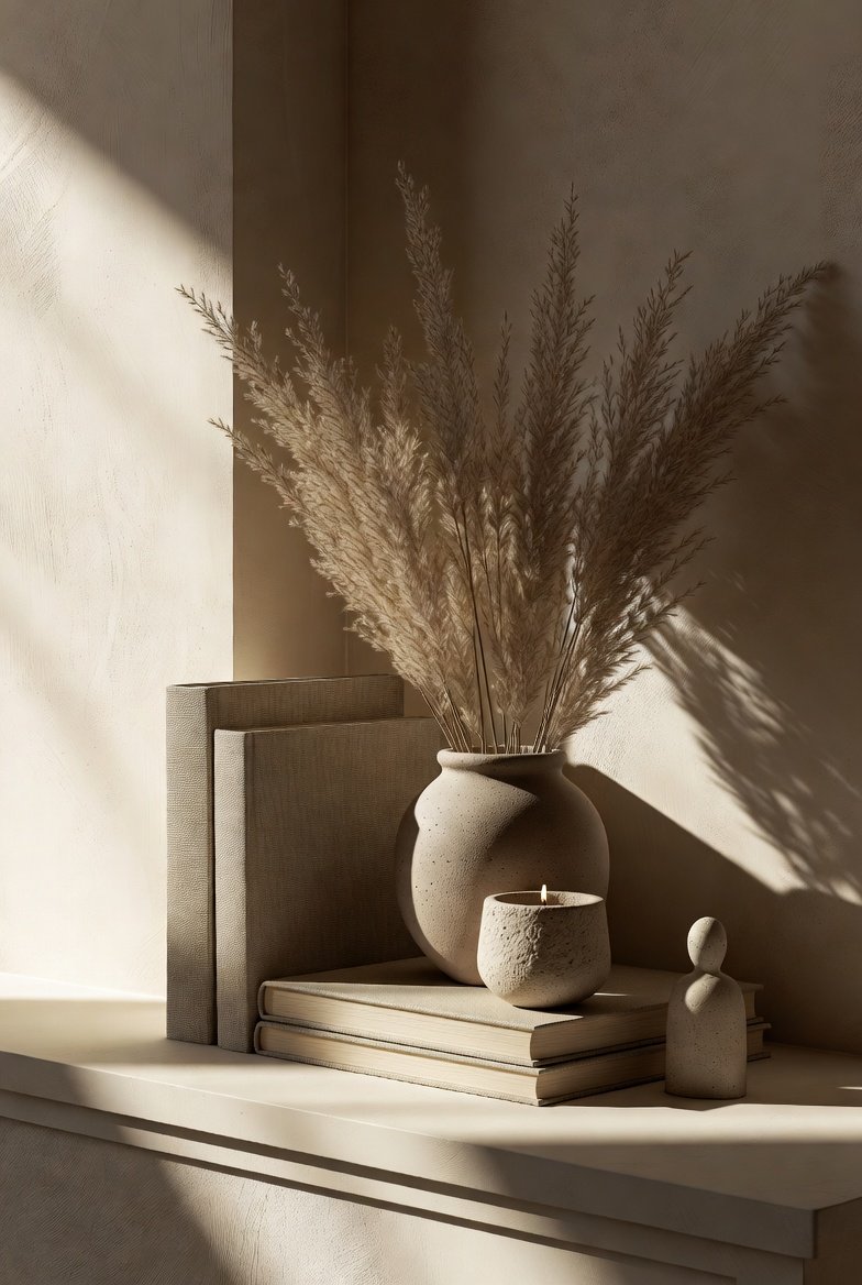
This is the tip most people get completely wrong: they scatter decor pieces evenly around a room instead of grouping them.
Neutral spaces come alive when you cluster three to five items together in a small vignette say, a stack of books, a ceramic vase, and a small plant on a console table rather than spreading single objects thinly across every surface.
Follow the classic rule of odd numbers: groupings of three or five feel more visually balanced than groupings of two or four. This one styling trick instantly makes a neutral room look curated instead of sparse.
8. Layer Rugs for Warmth and Definition
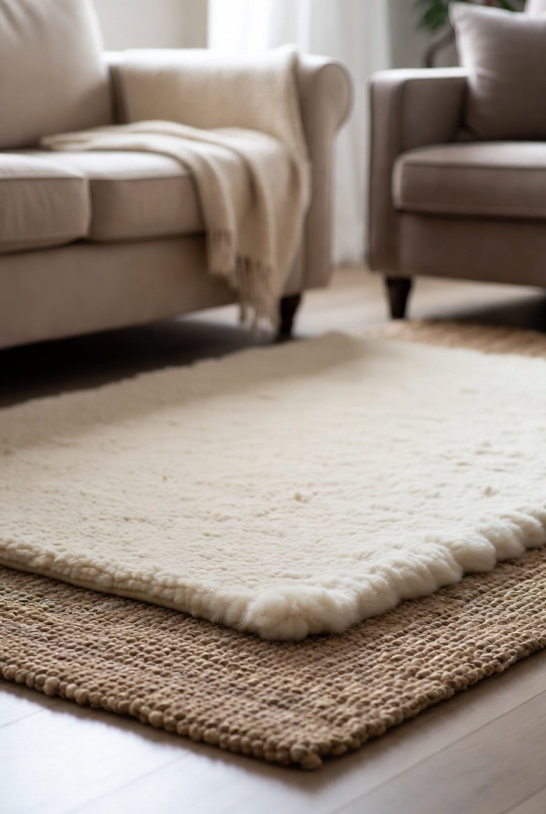
A single flat rug can make a neutral room feel unfinished. Instead, try layering a smaller textured rug (like a wool or sheepskin) over a larger flat-weave natural fiber rug (like jute or sisal).
This does two things at once:
- Adds visual and physical texture underfoot
- Helps define separate zones in an open-concept space
Stick to tonal variations within your neutral palette so the layers feel intentional, not mismatched.
9. Mix Warm and Cool Undertones Carefully
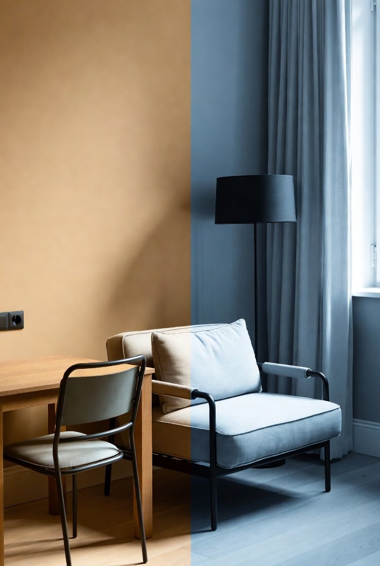
Not all neutrals are created equal. Some lean warm (cream, beige, terracotta), while others lean cool (grey, taupe with blue undertones). Mixing them carelessly is one of the fastest ways to make a neutral room feel “off” without knowing why.
So what does this mean for you? Pick a dominant undertone warm or cool and let it guide roughly 80% of your palette. Use the opposite undertone sparingly, as an accent only, to avoid a muddy or mismatched look.
10. Bring in Pattern Through Texture, Not Color
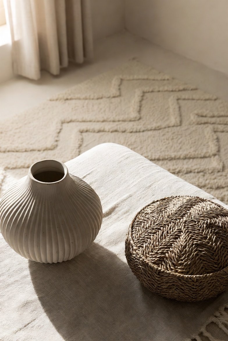
You don’t need bright colors to add pattern to a neutral room. Subtle textural patterns like a herringbone weave, a bouclé fabric, or a hand-thrown ceramic with visible ridges add dimension while staying entirely within your neutral palette.
This is a favorite trick among interior designers for keeping a neutral space from feeling flat while never breaking the calm, cohesive color story.
11. Use Lighting as a Design Layer, Not an Afterthought
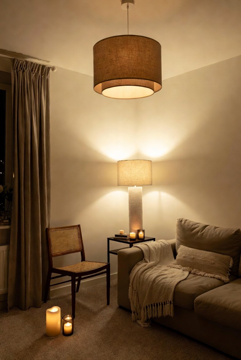
Neutral rooms live or die by their lighting. Harsh overhead lighting can make a neutral palette feel cold and clinical, while warm, layered lighting brings out the coziness these tones are capable of.
Aim for at least three light sources per room:
- Ambient (overhead or natural light)
- Task (reading lamps, under-cabinet lighting)
- Accent (candles, string lights, a statement floor lamp)
Choose warm-toned bulbs and natural materials like rattan or linen lampshades to keep the lighting fixtures themselves on-aesthetic.
12. Apply the Aesthetic Room by Room
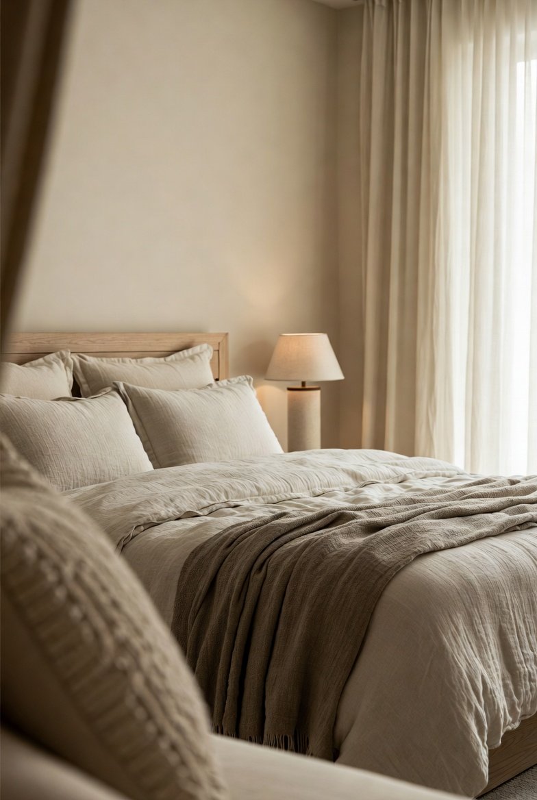
A neutral aesthetic doesn’t have to look identical in every room it just needs a consistent thread running through the whole house.
- Living room: anchor with a statement neutral sofa, layer in a jute rug, and finish with a sculptural coffee table.
- Bedroom: focus on textiles a chunky knit throw, linen bedding, and a woven headboard for a space that feels like a retreat.
- Kitchen: lean into natural materials like a wood charcuterie board, ceramic dishware, and open shelving to keep things airy.
- Home office: a neutral, low-stimulation palette has been shown to support focus, so keep the desk area clutter-free with woven storage baskets.
- Bathroom: stone-look tile, natural fiber bath mats, and a few dried botanicals bring the aesthetic somewhere most people forget to try it.
13. Embrace Minimalism — But Don’t Confuse It With Emptiness
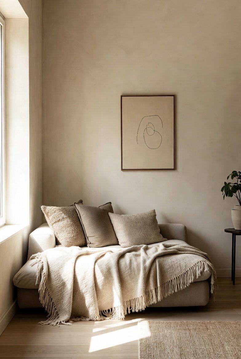
A minimalist approach can absolutely work within a neutral aesthetic, but there’s a meaningful difference between “minimal” and “empty.” A well-edited neutral room still has layers of texture, a focal point, and a few curated vignettes it just doesn’t have clutter.
Before adding anything new to a neutral space, ask: does this add texture, warmth, or a focal point? If not, it might be the clutter your calm room doesn’t need.
Common Neutral Decor Mistakes to Avoid
Mistake #1: Matching everything too closely. If your sofa, walls, curtains, and rug are all the exact same shade of beige, the room loses depth instead of gaining calm. Aim for tonal variation, not a perfect match.
Mistake #2: Skipping contrast entirely. A neutral room without any darker accents black hardware, espresso wood, charcoal throw pillows can start to feel washed out under certain lighting.
Mistake #3: Forgetting the ceiling and trim. A stark white ceiling against warm greige walls can create an unintentional cool-warm clash. Keep the undertone consistent from floor to ceiling.
Mistake #4: Choosing synthetic materials because they’re cheaper upfront. They tend to look flat, wear out faster, and lack the texture that makes neutral rooms feel expensive. A single well-made linen throw or solid wood side table often does more visual work than several synthetic pieces combined.
Mistake #5: Decorating in one sitting. The most convincing neutral rooms are built slowly, piece by piece. Give yourself permission to live in a space for a while before filling every surface.
A Simple Checklist Before You Start Shopping
- Have you settled on a dominant undertone (warm or cool) for the whole room?
- Do you have at least three different textures planned (soft, rough, smooth)?
- Is there one clear focal point the eye can land on?
- Are at least some of your material choices natural or sustainably sourced?
- Have you planned for layered lighting, not just one overhead fixture?
- Do you have a plan for greenery, even if it’s just one low-maintenance plant?
Why a Neutral Aesthetic Is Worth the Investment
Trend-driven decor has a short shelf life. A neutral aesthetic sidesteps that cycle entirely because the palette itself doesn’t chase trends, you’re free to invest in higher-quality, longer-lasting pieces without worrying that they’ll feel out of place next season. Combine that with natural, sustainably sourced materials, and you end up with a home that’s not just calmer to look at it’s a genuinely lower-impact way to live.
Frequently Asked Questions
Does neutral decor mean everything has to be white or beige?
No. Soft greys, warm taupe, clay, olive, and deep browns all count as neutral. The key is that they’re muted and earth-inspired rather than bold or saturated.
How do I keep a neutral room from feeling boring?
Layer at least three textures, add one statement piece as a focal point, and group decor items into small vignettes instead of spreading them evenly around the room.
What’s the easiest way to start decorating with neutrals on a budget?
Start with textiles a throw, some pillow covers, and a natural fiber rug before committing to paint or furniture.
Are neutral aesthetics compatible with sustainable, eco-friendly decor?
Yes, very naturally. Materials like reclaimed wood, linen, jute, and wool are both inherently neutral in tone and lower-impact than synthetic alternatives.
Can I mix a neutral aesthetic with other styles, like boho or Japandi?
Absolutely. Neutral is more of a color philosophy than a rigid style, which is exactly why it blends so easily into boho, Japandi, coastal, or modern farmhouse looks.
How many neutral tones should I use in one room?
Most well-balanced neutral rooms use three to five different tones across walls, furniture, and accents.
Final Thoughts
A neutral aesthetic isn’t about playing it safe it’s about building a home that feels calm, considered, and genuinely yours. Start small: pick your palette, layer in a few natural textures, and add one focal point you love.